Project Goal and Project Progress:
To pursue high-standard typography crafting, it was necessity to find the 'right' candidate. After taking tremendous amounts of research, it came down to this conclusion that the city, Tokyo was the right candidate to embody it's characteristics into the typography. It was vital to reflect the essence of Tokyo into the typography: to incorporate it's moderness, practicality and technical elements. The original intention of type making was to puruse developing a type that would be suitable in a modern-day environments. To do that, it was vital to choose the city that matched the characteritics of type.
To pursue high-standard typography crafting, it was necessity to find the 'right' candidate. After taking tremendous amounts of research, it came down to this conclusion that the city, Tokyo was the right candidate to embody it's characteristics into the typography. It was vital to reflect the essence of Tokyo into the typography: to incorporate it's moderness, practicality and technical elements. The original intention of type making was to puruse developing a type that would be suitable in a modern-day environments. To do that, it was vital to choose the city that matched the characteritics of type.
And Tokyo was selected.
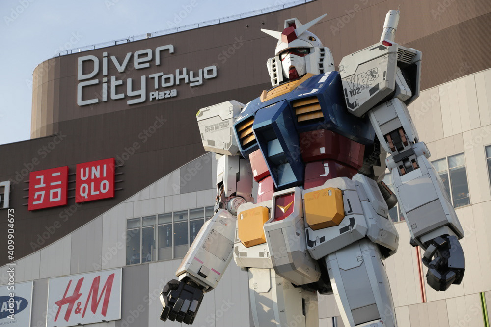
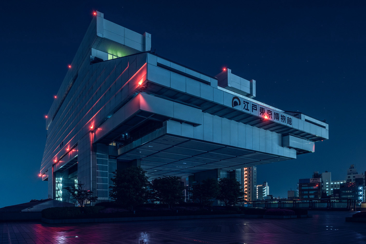
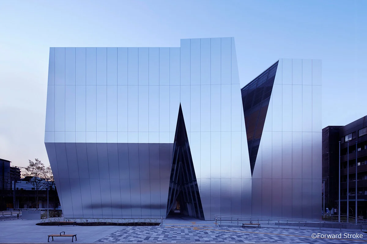
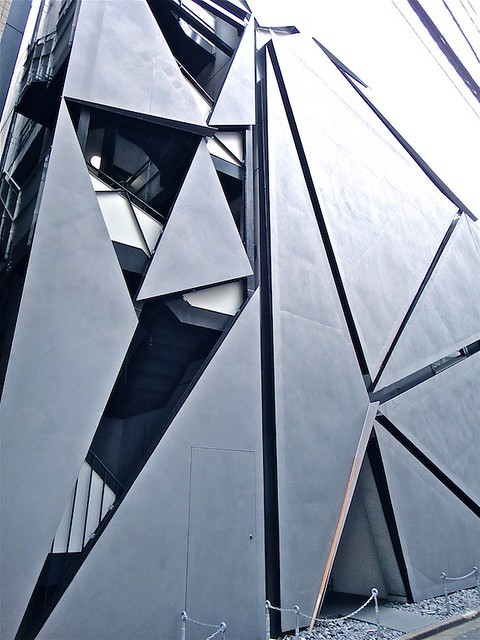
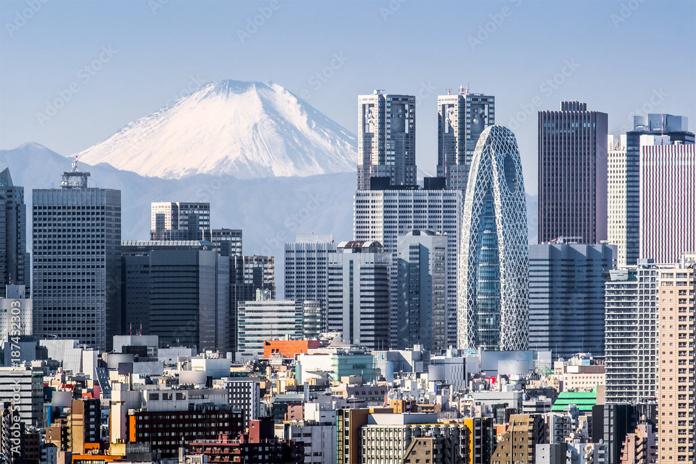
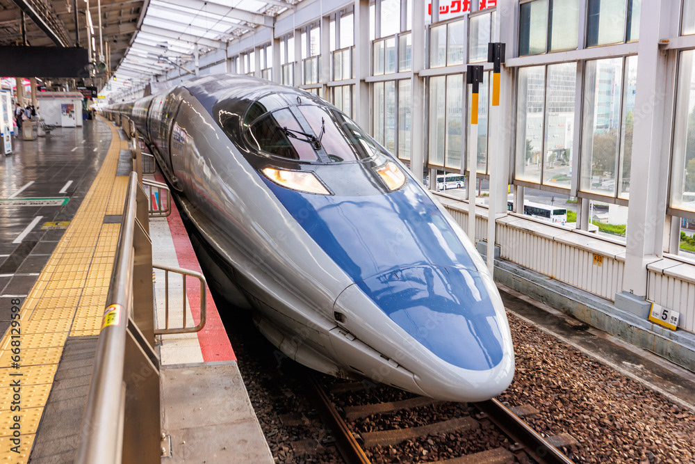
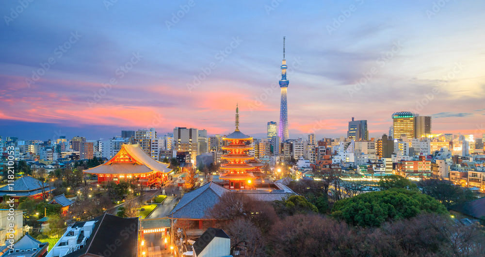
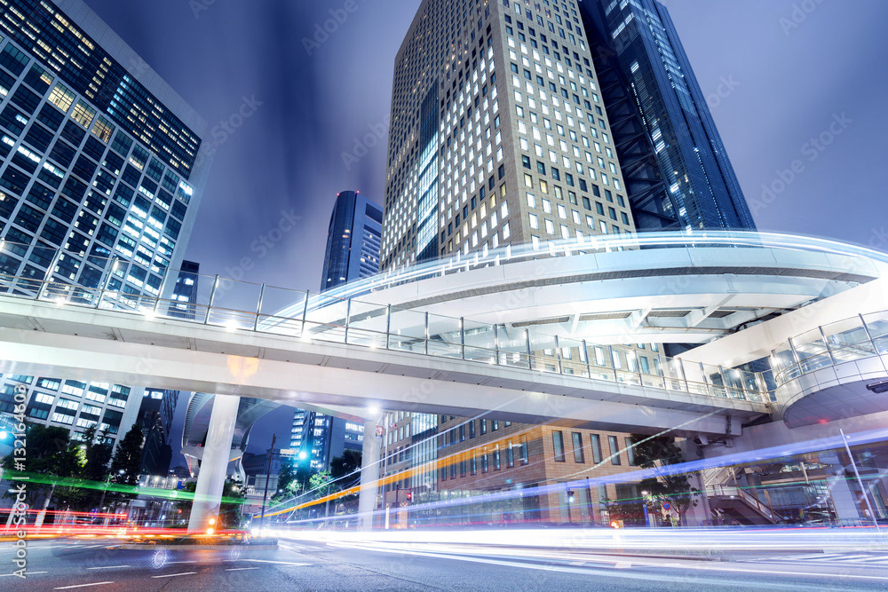
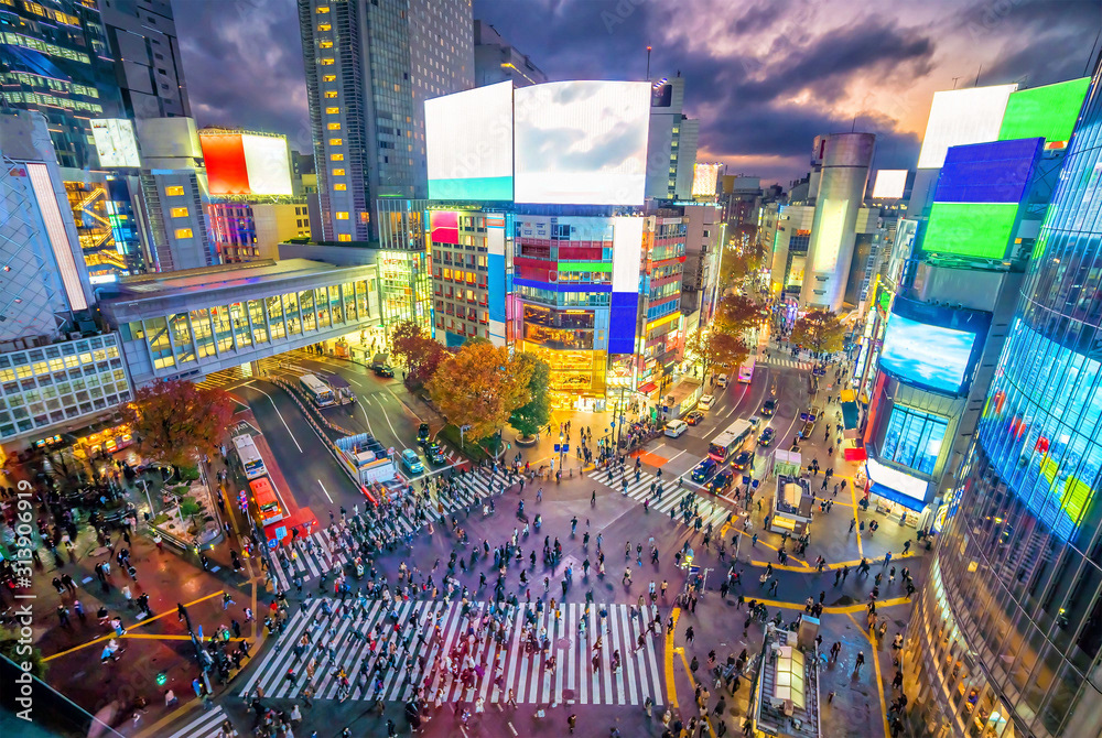
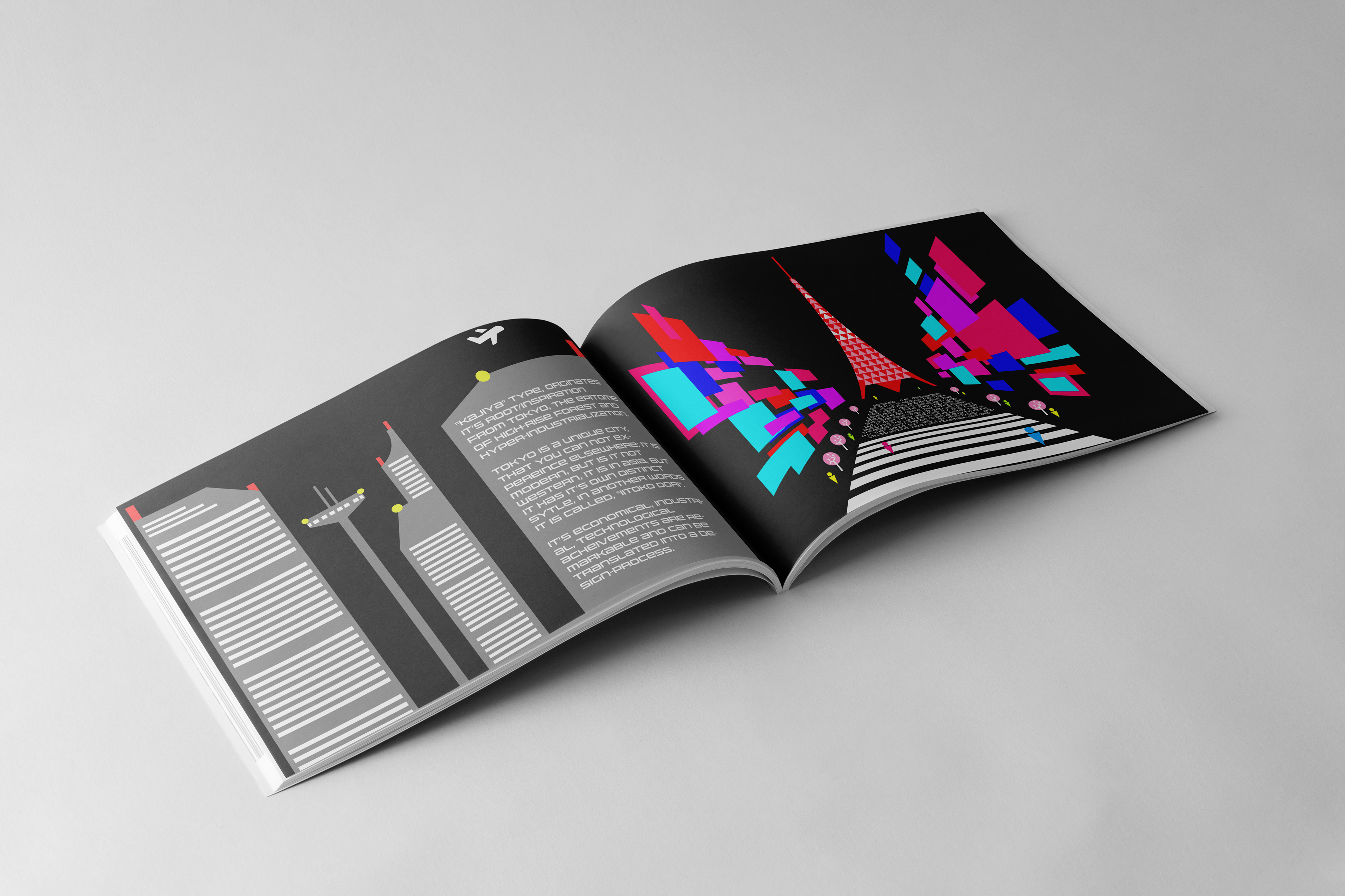
With it's industrial might and craftmanship, Tokyo could not be better for the choice to reflect modern, digital and industrial elements. The challnge was, how to reflect main elements of Tokyo into a type. First, it was important to recognize and understand the functions of Tokyo. It embodies various types of technologies at once: Bullet train, high-rise buildings, neon signs and robotics. Second, characterizing those elements into a type required a lot of research. And lastly, putting symbolic and iconic characteristics of Tokyo into the type as much as there can be.
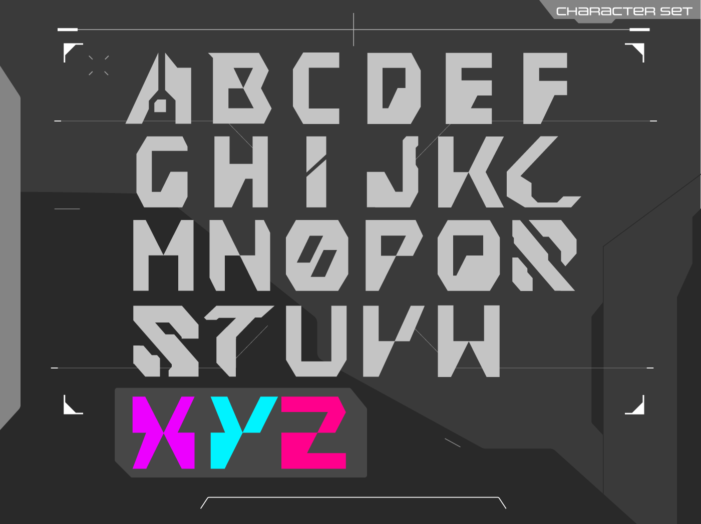
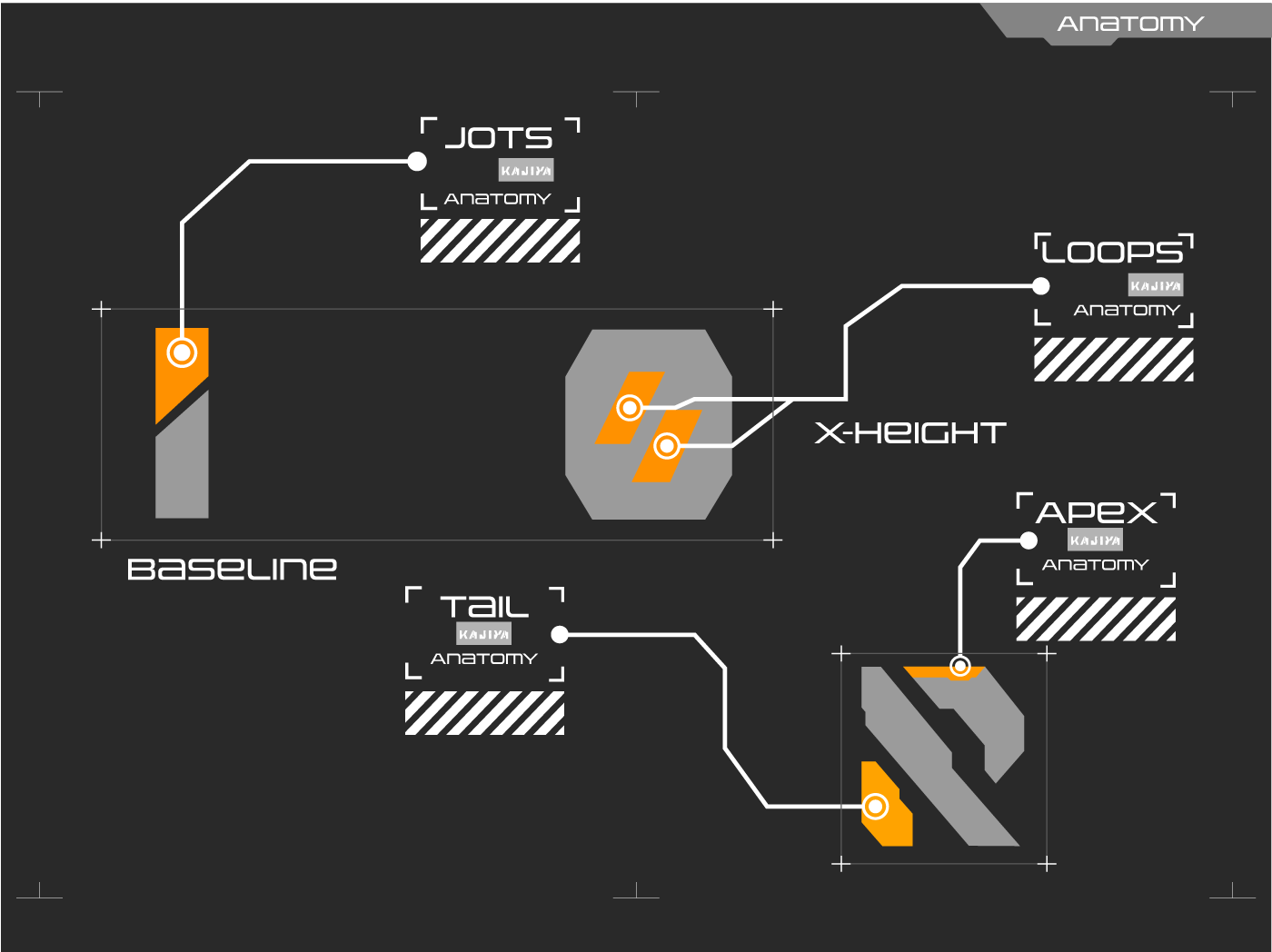
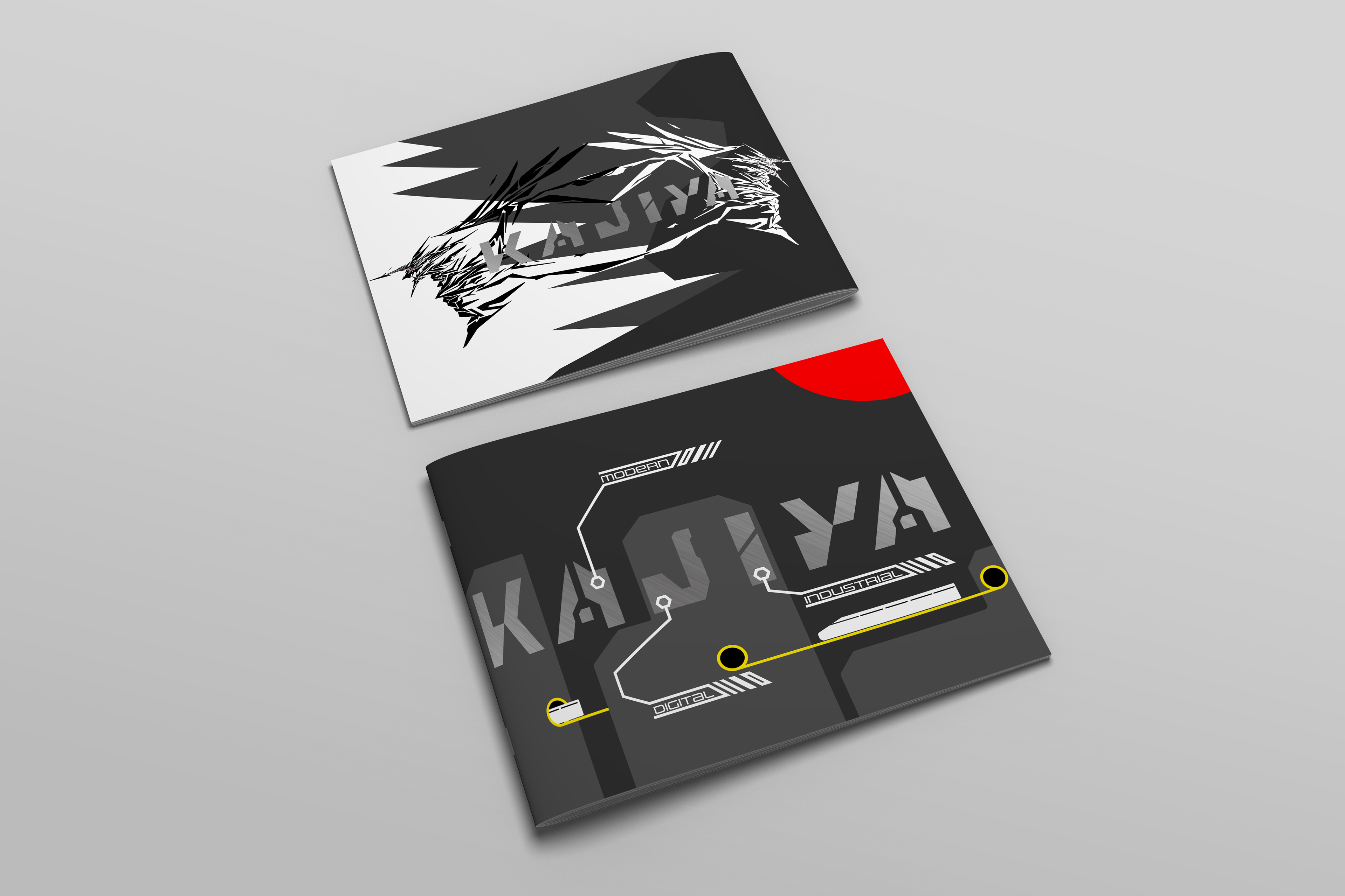
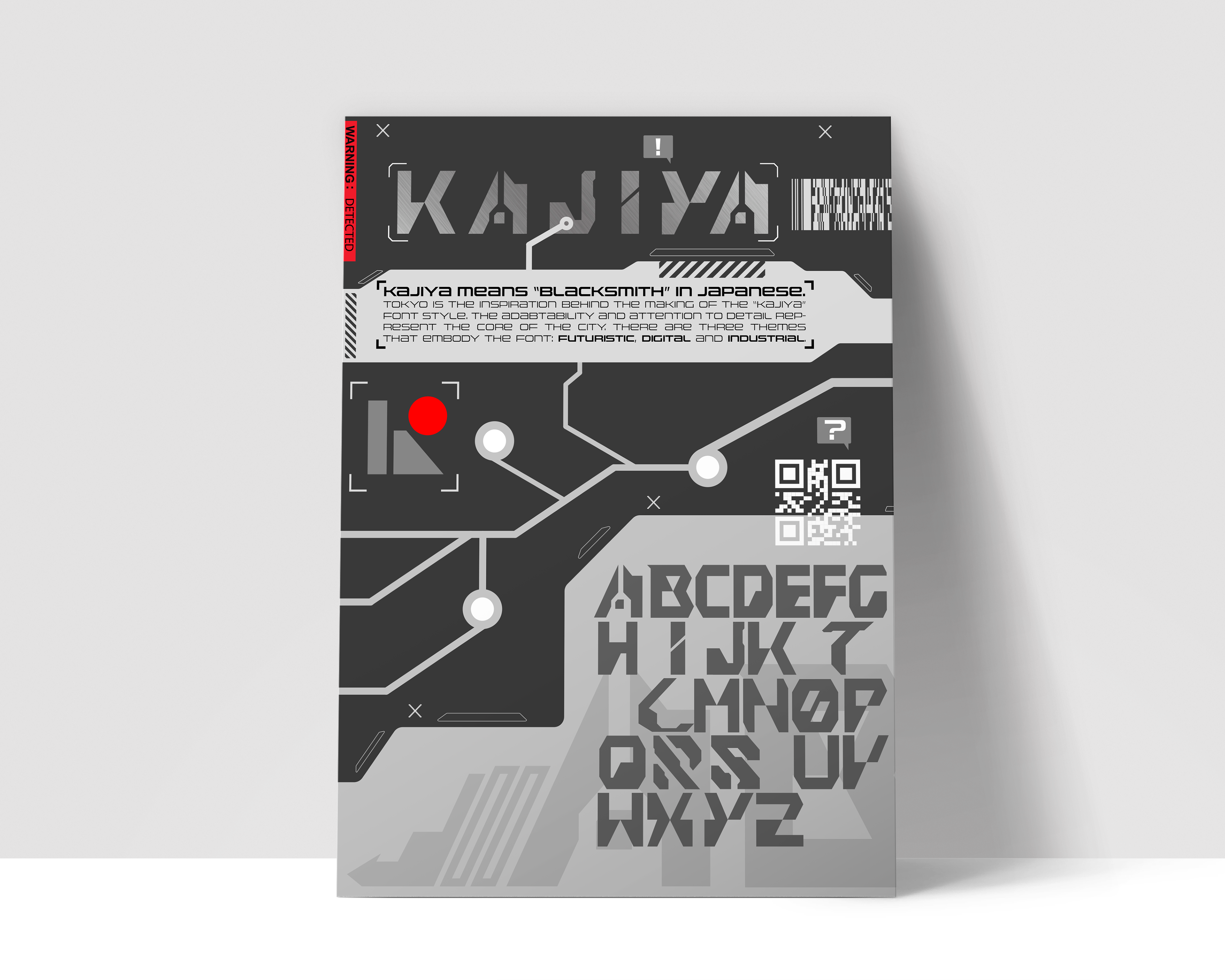
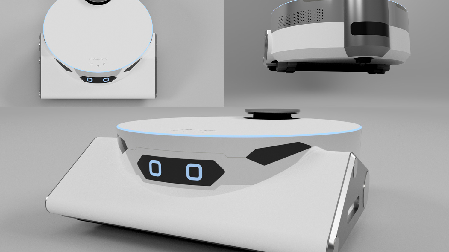
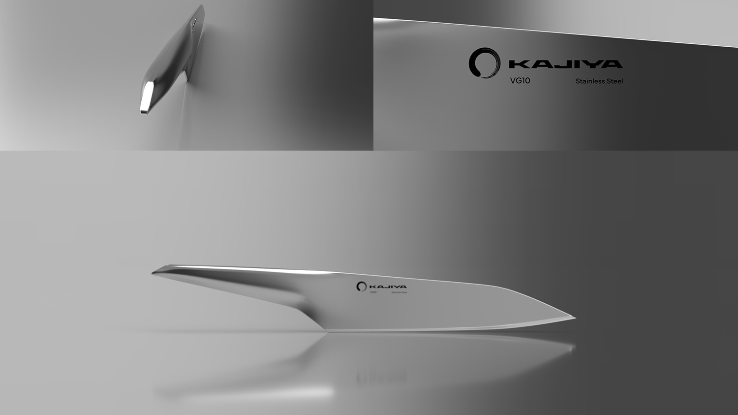
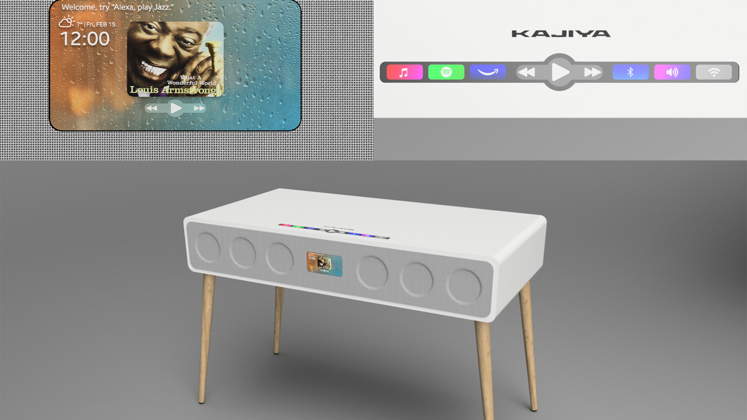
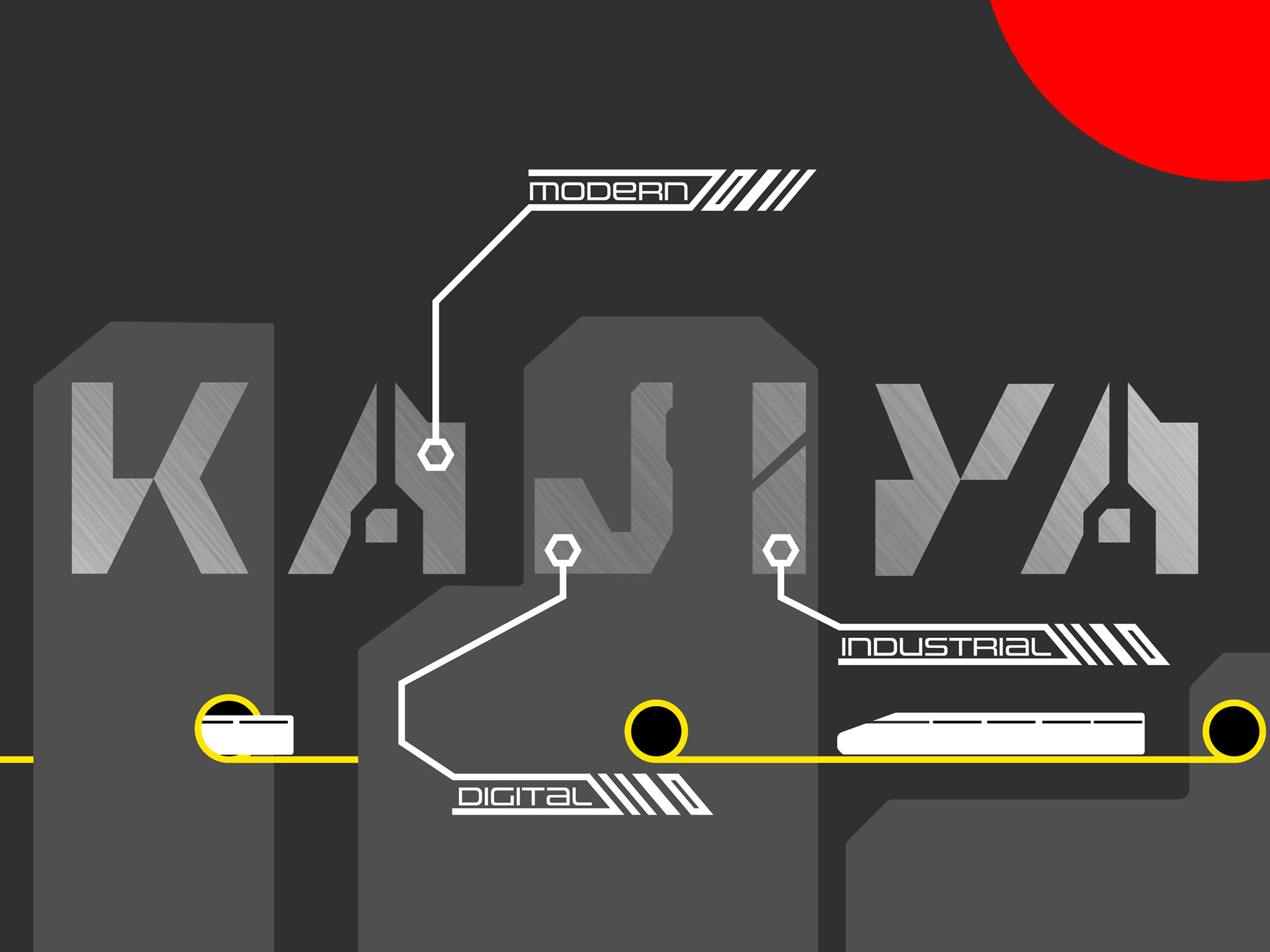
Overall, the type, "Kajiya" incorporates industrial, modern and digital components by having shapes that are geometric, irregular and technical. It distinguishes itself from other types by showing that they are not regular, common and mild. Instead, they prove their worthy by showcasing how compatible they can be with modern, urban environments.
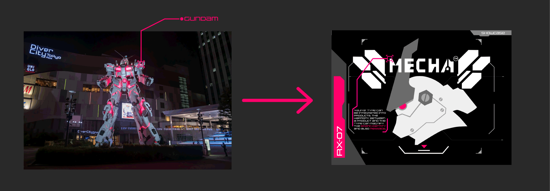
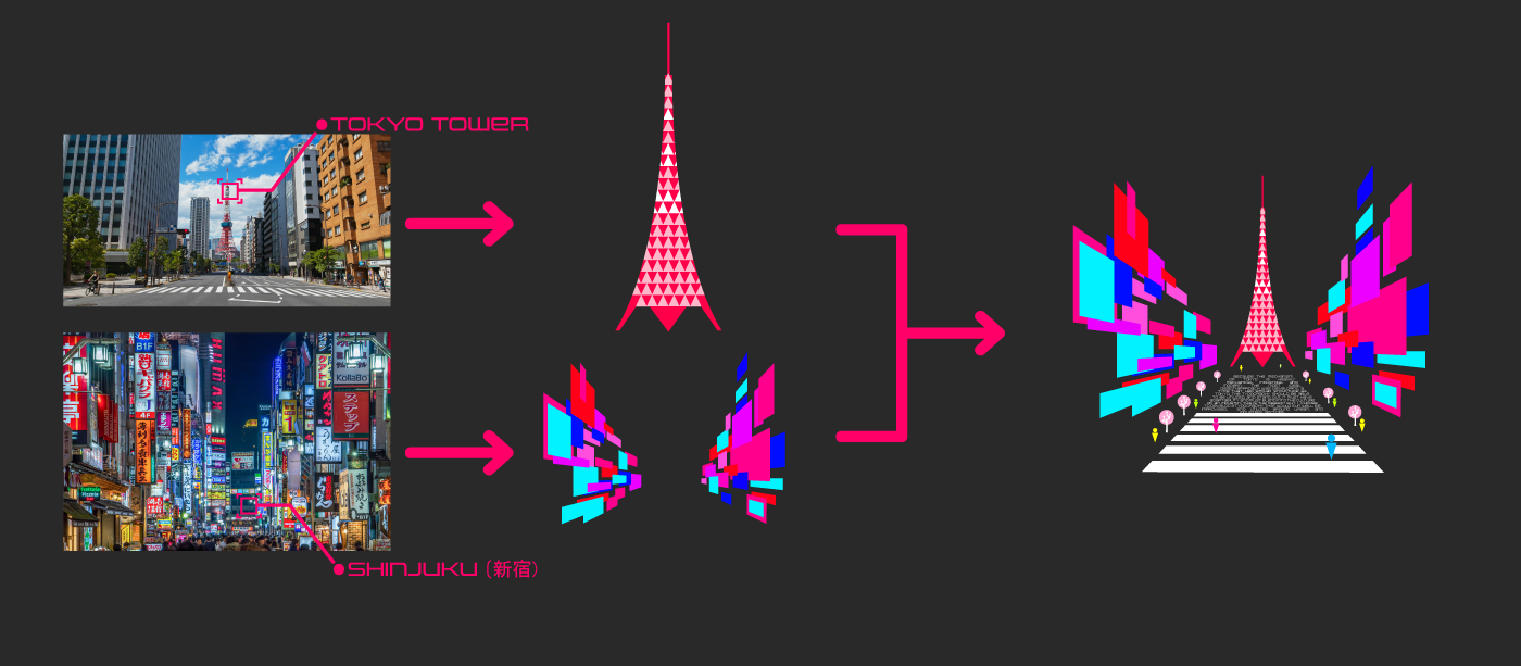
When it came down to showcasing the type on booklets, it was important to incorporate iconic symbols of Tokyo into it, to emphasize what makes the type related to Tokyo. Therefore, I utilized visual elements/assets to persuade and explain to the readers that the type is linked to Tokyo's symbolic elements. In that way, it can better understading of the audinece that the type is rooted in Tokyo's atmoshpere.